//
PRODUCT BRIEF
//
FOREWORD
When Showpad reached out to littlevoice, my design agency at the time, Showpad Sales Enablement platform has been entering a new era. After multiple years of organic growth, the platform had expanded beyond the in-house design team's capacity.
Given the limited timeframe, we agreed that the in-house design team would focus on immediate improvements to the client-facing environment — the one sellers used to present materials, pitch products, and close deals. littlevoice would take ownership of the Online Platform (OP), the environment used by content managers to create, organize, and manage assets for the sales team.
//
MY ROLE
As design Lead, I carried multiple responsibilities. I first needed to establish the right UX methodology — one that would allow me to onboard my team quickly and give everyone a clear understanding of the project’s background, constraints, and roadmap. At the outset, our team consisted of myself, a Creative Director and a junior UI/UX designer, and later expanded to include two dedicated researchers as the scope deepened.


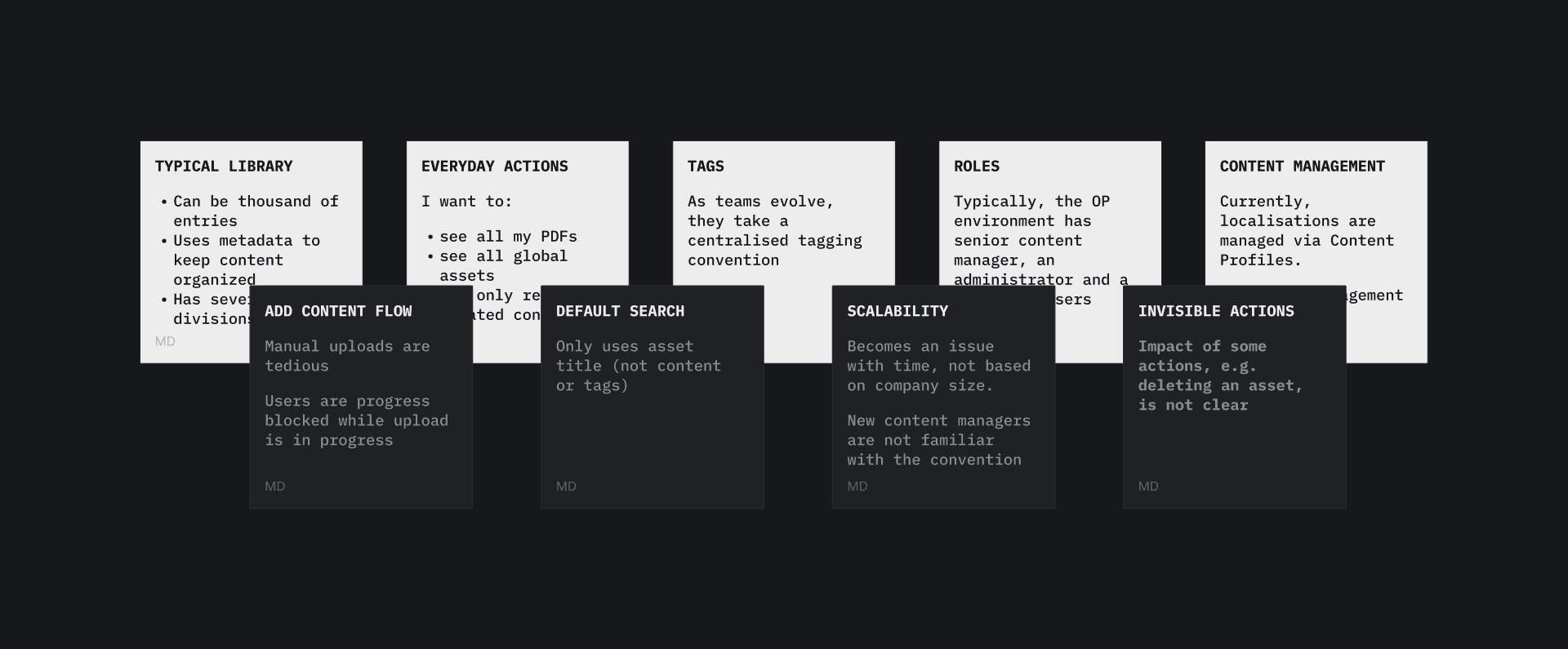
At the same time, I was trying to establish an open and engaging communication with the client's stakeholders, customer support managers, the in-house design team, researchers, and anyone necessary to keep momentum high and avoid unfeasible design solutions.
Luckily for me, Showpad’s friendly and collaborative culture gave our team a strong start. We were able to define our priorities, find common ground on the project scope, expected deliverables and timeline.
DESIGN CHALLENGE
THINKING BIG, TESTING SMALL
The OP side of Showpad’s enablement platform hadn’t received significant design attention in years. It had grown dense, fragmented, and difficult to use. Our plan was to split our efforts in two directions.
First, we focused on quick, high-impact usability fixes that could immediately improve most frequent tasks. A deep, hands-on UX audit allowed me to pinpoint those.
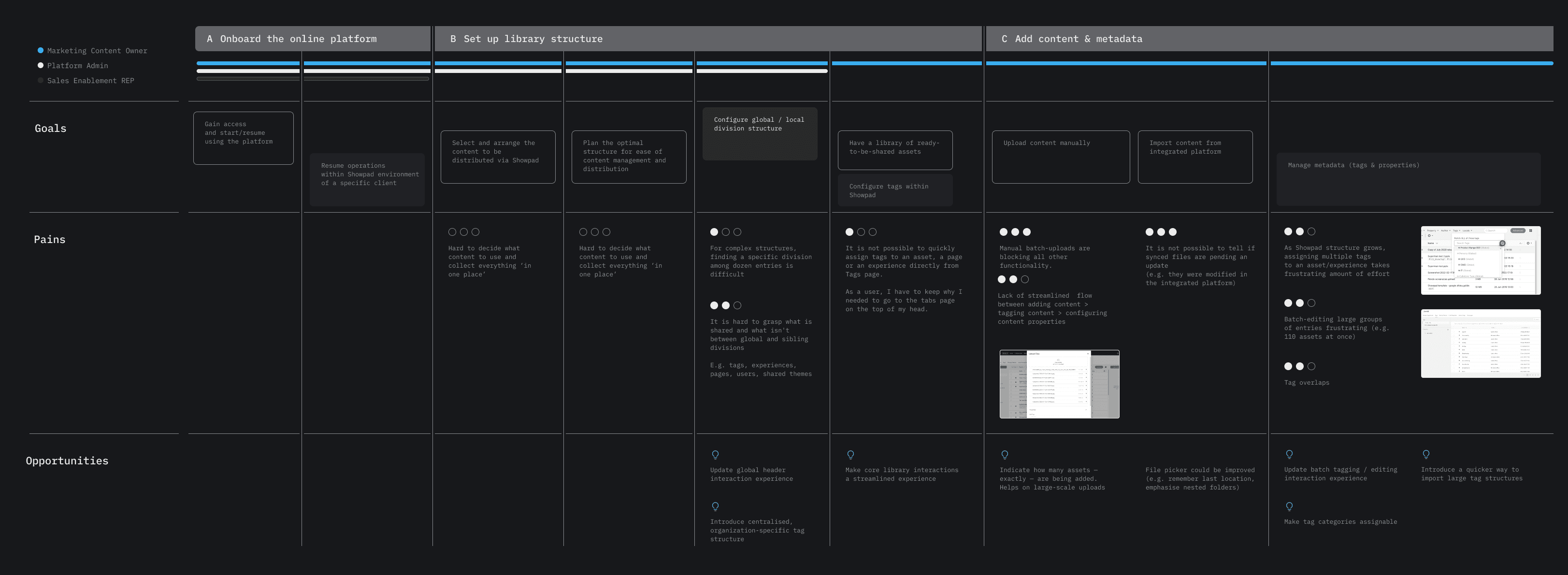


In parallel, we began exploring North Star concepts for the platform’s longer-term evolution.This included ideas like automated metadata operations, AI-assisted duplicate management, multilingual content management, simplified navigation, etc.
Our intention was to bring most promising designs to the focus test scheduled for final month of this project.
SHORT TERM SOLUTIONS
REDUCE, SIMPLIFY, ACCELERATE
At first, we focused on automating tedious, repetitive tasks using the existing visual language, while intentionally designing new components and patterns so they could be seamlessly transferred to our long-term vision.


USER RESEARCH
FROM ASSUMPTIONS TO EVIDENCE
With support from the in-house research team, we recruited nine current Showpad users with different roles and levels of experience. Each participated in a one-hour session structured around the prototype we had prepared.
The prototype simulated a realistic working environment and asked participants to complete four tasks. These tasks covered key parts of the updated experience, including the side panel, main viewer, object viewer, upload flow, and batch operations.
This setup allowed us to observe how users interacted with the redesigned elements in context and see where the new patterns supported or challenged their workflows. These observations gave us qualitative insight into real user behaviour and helped clarify which parts of the experience required further refinement.
THE IMPACT
THAT WAS INFORMATIVE… SO WHAT DO WE DO NEXT?
One thing I learned during my time with littlevoice is that neither large nor small companies place their trust in design heuristics or fancy metrics alone — they trust their users.
Research validated immediate improvements and provided context for the long-term direction. It aligned Showpad stakeholders around a clear path forward for the platform.








DISCLAIMER
To protect customer privacy, the feedback shown above is real, but all photos and names have been altered and names removed.
GENERAL FINDINGS
Our sessions showed that the new structure and flow successfully addressed several long-standing issues in the current experience. Participants with different levels of expertise had developed strong habits, and some initially worried about losing familiar interaction patterns.
However, overall sentiment toward the redesign was far more positive than expected. Most users saw the changes as a step in the right direction, noting that a gradual introduction would make the transition smoother.
KEY TAKEAWAYS
Eight out of nine participants completed all assigned tasks without difficulty. The batch editing improvements received the strongest reaction, followed by the ability to copy and paste metadata — both viewed as clear time-savers that would significantly improve platform use efficiency.
WHAT CAME NEXT
With the limited time remaining, we prioritized refining the designs based on our findings, presenting our takeaways to Showpad’s key decision-makers, and handing over both ready-to-implement short-term solutions and more distant long-term design strategy.
Although the client was impressed with the work my team and I delivered — especially our ability to navigate complex topics, manage the product lifecycle, and plan strategically — Showpad ultimately chose to build an internal design team. Since October 2023, I have not been involved in further design efforts for this client.